

When looking for window treatments, one of the most enjoyable yet challenging choices you’ll have to make is selecting the colour that’s just right. Should you choose a neutral option or take a chance on a popular pattern that might look old in a few years?
Are you ready to spruce up your home and select new blinds? When shopping for window treatments, selecting the ideal colour for the space can be one of the decisions that can be both the most pleasurable and the most difficult to make. Blinds can be a major investment, and making the right choice is important. Select the blinds that are right for you and match well with your home decor.
You can use our suggestions to pick a window treatment colour that you’ll love for years. Here are six tips to choose the best blind colors:
Tip #1: Match your blinds with your wall colour

Matching your blinds to the colour of your walls is an easy way to add elegance to any room. Tone-on-tone ensembles are quite popular now, and this is a simple way to follow the trend. For a complementary appearance that doesn’t feel too heavy, you can also choose a hue that is a few shades lighter than your wall colour.
Tip #2: Match your blinds with your flooring
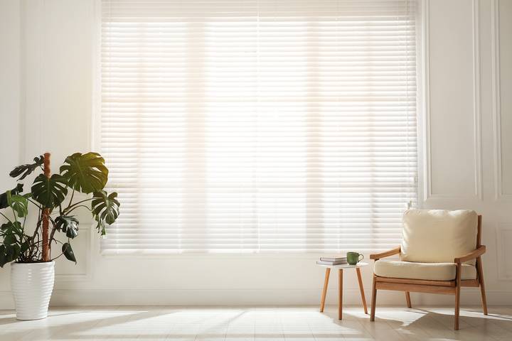
Do you have lovely carpeting, wood floors, or cabinets? A fantastic technique to add natural tones to your windows is to match window treatments to other finishes or furnishings. Various natural hues and stains are available in wood shades, wood shutters, wood blinds, and even faux wood blinds to match any décor style.
To make the colours of fabric window treatments stand out, you can also match the materials to decor items like pillows, books, carpets, or accent chairs. You can even try matching a gorgeous roman shade, roller shade, or piece of drapery to your favourite rug or fabric sofa.
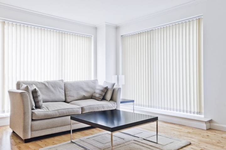
Tip #3: Match your blinds with your window trim
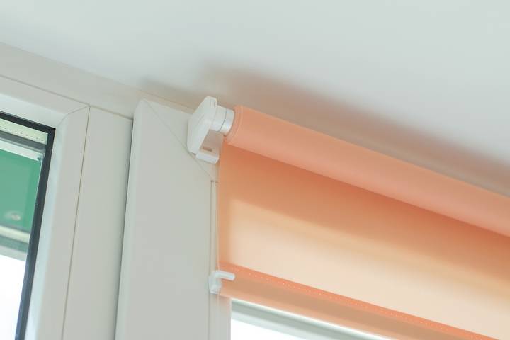
Many rely on the foolproof tactic of matching the blinds or shades to the window trim colour. You can’t go wrong with this neutral style because most trim is white or off-white, so there won’t be any decor conflicts.
If you don’t want the eye to be drawn to your windows, pick this option. This timeless appearance won’t go out of style anytime soon.
Tip #4: Add drama with a contrasting colour.

A bright colour, like bright blue or sage green, makes a statement and unifies a space when used with white or other neutral tones. However, neutrals and solid colours complement this high-contrast design effectively.
A wood blind with a dark stain or a contemporary black shutter in a light-coloured space will stand out while still looking classic. Consider blending wood tones with contrasting draperies to make a window more of a focal point. Strong colours feel more integrated into space when paired with a neutral layer.
Tip #5: Take your room size into consideration.
Is your space compact? A room might feel lighter, bigger, and more open by decorating your windows with a lighter hue. Tiny windows with blinds in dark hues can make a room appear even smaller. Therefore, err on the side of caution when in doubt.
But think about using a darker colour to add depth and create a cozier atmosphere in larger areas or rooms with plenty of windows. Consider how the space will appear when the blinds or shades are drawn and how much of that colour you will see if you have huge glass panes, such as a sliding door.
Tip #6: Ask for professional design help.

Still unsure of your course of action? A professional design consultant is highly recommended. They can offer you good advice that is both trendy and falls in line with your personal preferences.